Retro-futuristic Interiors
(Based on Illustrations by Lois Le Roy)
What inspired this work?
I’ve always been a fan of the retro-futuristic aesthetic. Growing up, my favourite game series was Fallout. The games take place in a post-apocalyptic setting, yet remnants of 1960s décor can be found everywhere in the wasteland. This combined with futuristic elements housed the theme of retro-futurism across the series. The more I played these games the more I fell in love with tyle of the “60s but also the concept of retro-futurism in particular.
During the start of 2020, I stumbled across concept art by Louis Leroy and his retro-futuristic illustrations straight away interested me. Being stuck in lockdown I decided it could be a fun personal project to try and model one of his illustrations, and with the artist’s permission, I got to work. Many techniques within this project were brand new for me as I hadn’t created detailed interiors before, and my use and experience of textures was fairly limited, so this was a great opportunity to learn a few new skills. Although I only started with the intension of modelling one of the scenes, upon completing it I quickly moved on to model a couple more, completing a set!
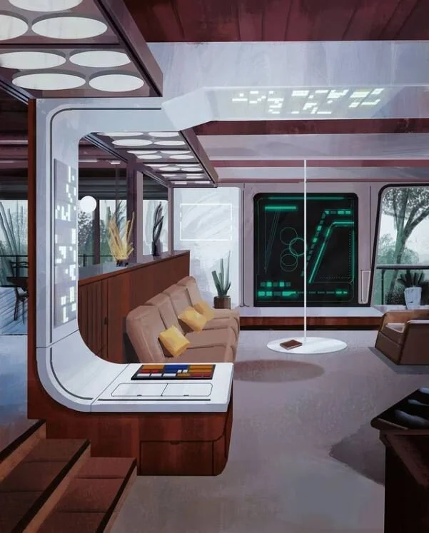
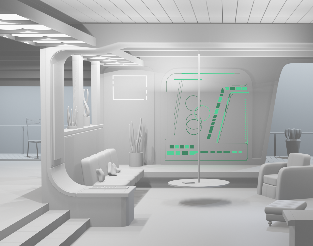
This was the first scene I modelled based on LeRoy’s work. Personally, it is my favourite of all of his illustrations, and I hope the final renders do his work justice. I couldn’t get the camera angle exact, but I believe I got most things in proportion and true to the artist’s design. If I had to redo this project, I would make the textures more noticeable. Most things in the scene were textured, such as the carpet, chairs, walls etc, but they are difficult to spot from a distance. I wanted to capture the style of the scene, including the brushstrokes and blotches of paint, and whilst it is present in the actual scene, it isn’t clear or obvious in the final render. Regardless, it was really fun to get into and I’m proud of the outcome!
Original Concept art by Louis LeRoy (Click on the image or here to be taken to his page)
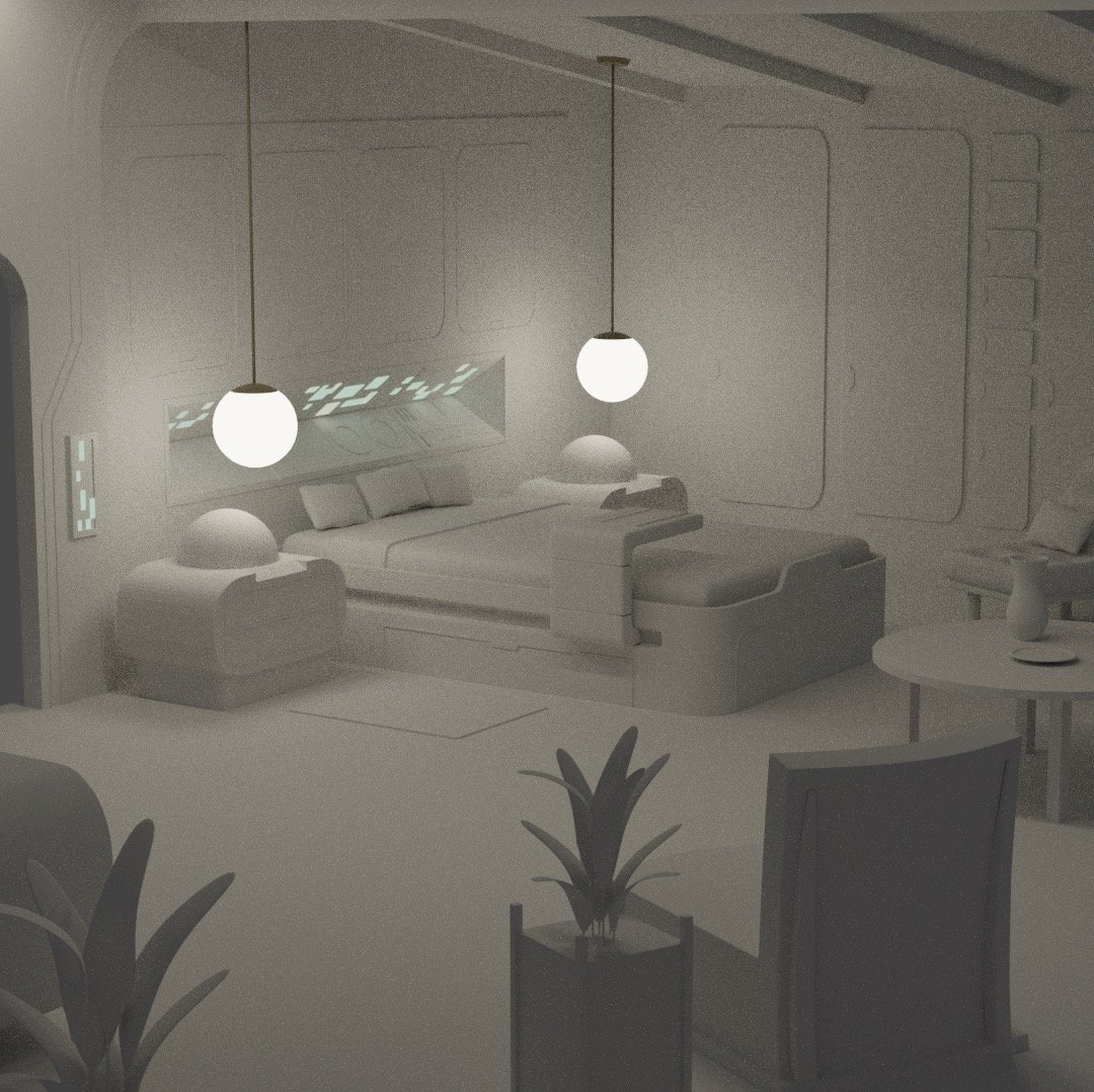
After modelling the first piece of concept art, I was really inspired to carry on. With this scene, I really tried to make it as close to the original work. Improving on my last attempt at recreating his work, I made sure to make the changed base on what went wrong previously. The textures are more noticeable and the angle is a lot more in line with the illustration too. Overall I’m happier with how this one turned out; the biggest criticism I have is that the colours aren’t as saturated and warm as the original, but as a base model rendered in Blender, I’m very pleased with the outcome. I believe I have captured the same detail and atmosphere shown in LeRoy’s concept. Although it isn’t very noticeable, I tried to make it as precise to his design as possible; the panels and buttons are exact to his work. On reflection, a couple of things could have been revisited, such as the plants, but this was a learning curve after all, and one of the first scenes I had modelled.
Original Concept art by Louis LeRoy (Click on the image or here to be taken to his page)
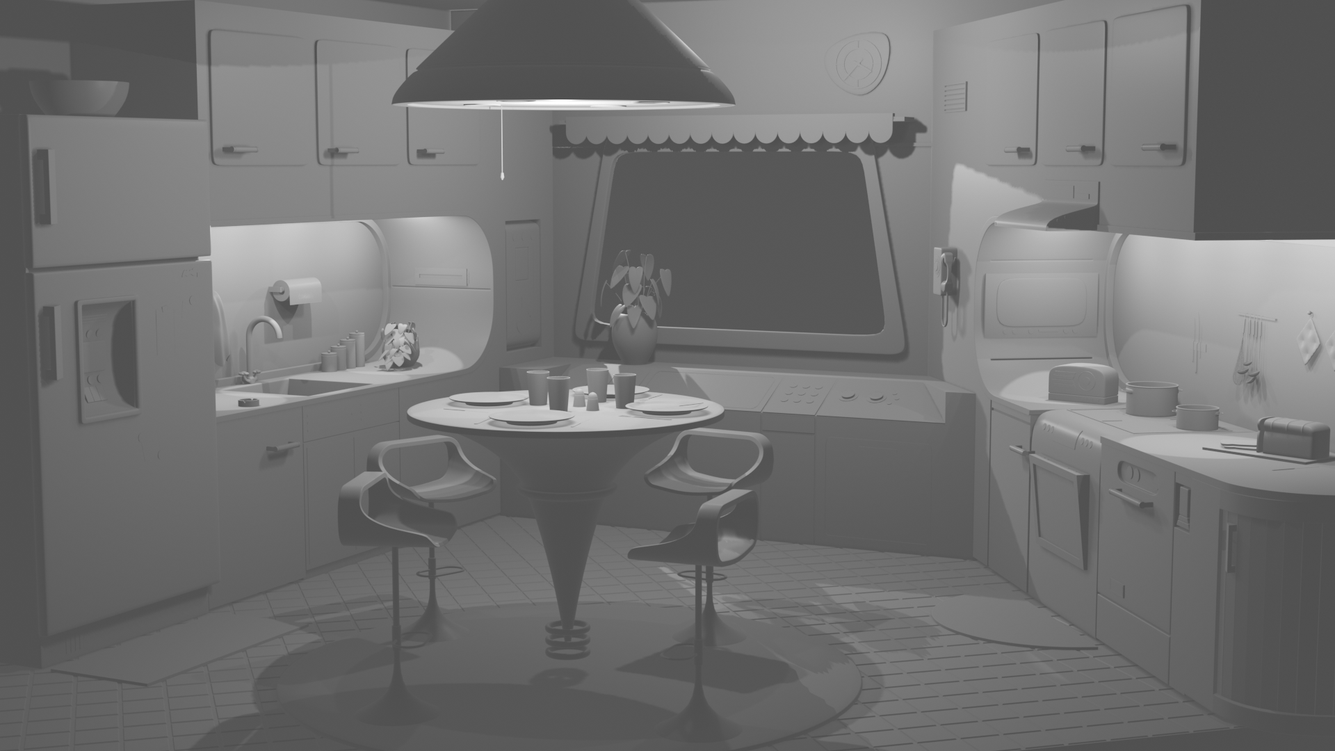
As of now, this is the final retro-futuristic scene designed by Louis LeRoy. This was by far my favourite piece to work on; I especially liked having the creative freedom to re-imagine the scene in colour. This scene required some research into 60s interiors, where I came to the decision to compliment soft pastel colours with wooden accents. I personally feel like the colour scheme and textures pair well and compliment each other. This scene doesn’t follow the same sort of painted style as the previous two pieces, however, I think it fits into the collection regardless. I loved working on this project, and I really appreciate the artist for giving me permission to recreate his work in a 3D setting! With most aspects of my work, my models have been based on my own designs. This occurs both in my professional work (such as Avian, Wimbledon and Jazz and Azul) as well as my personal work, so this was a nice change to be able to work based on concept art created by another artist, as it gave some sort of insight as to how I could work in a professional large scale environment.
Other Renders / W.I.P shots
Below you can see renders of the scenes before they were textured, as well as a side by side comparison that shows the bedroom model overlayed with the original concept to show how they match up.


![image0[6837].jpeg](https://images.squarespace-cdn.com/content/v1/6040efb624cd730f88e5f104/60359990-e5fb-4326-9274-4fafcd8eab02/image0%5B6837%5D.jpeg)