Stylized Exteriors
(Based on Illustrations by Sean Mulvenna)
What Inspired this work?
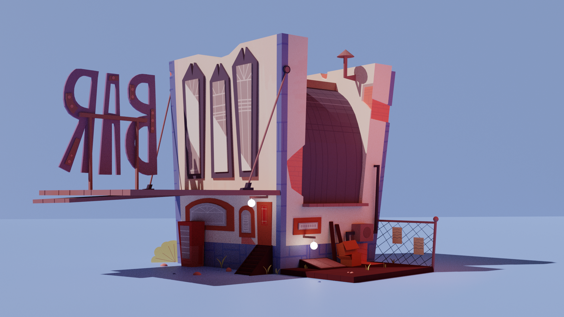
After modelling the retro-futuristic interiors designed by Lois Le Roy, I wanted to keep the momentum going and try something new. I had found Sean Mulvenna’s art account years ago and his work stood out to me straight away. The off proportion cartoonish look held a lot of vibrancy and character that really set his work apart. Additionally I loved that you could see how hand drawn his work is, the imperfections within his drawings added a unique touch that I found visually stunning. Most of Sean’s work is original character concepts, designed with exaggerated features. Originally I did plan to try modelling some of these, however his environmental art possessed a lot of detail and character which stood out to me more. After following him for so long, I really wanted to try my hand at recreating his exterior environments within a 3D space. After attaining permission from Sean to model his work, I went through his page, chose my favourite three drawings, and then got to work modelling them.
It had been a few years since I modelled outside scenes, so it was a nice return to creating these man made spaces. Using what I had learnt over the years I was able to quickly model and texture three scenes. Below are the the final renders alongside Sean’s work.
This was the first piece I recreated. I chose this one to begin with as I thought the angle was different. Many people show the subject of a photo or paining or illustration from its front and they centre it in the middle or just slightly off to the side if following the rules of three. However, this illustration showed the subject from behind, displaying a less obvious side of it. The odd angle stood out to me and I began working on recreating the scene!
Once the scene was modelled and textured I played around with lighting. I tried to stick to Sean’s design as closely as possible, but certain aspects of his design’s lighting isn’t realistic, with lights not casting lighting or shadows across nearby objects.
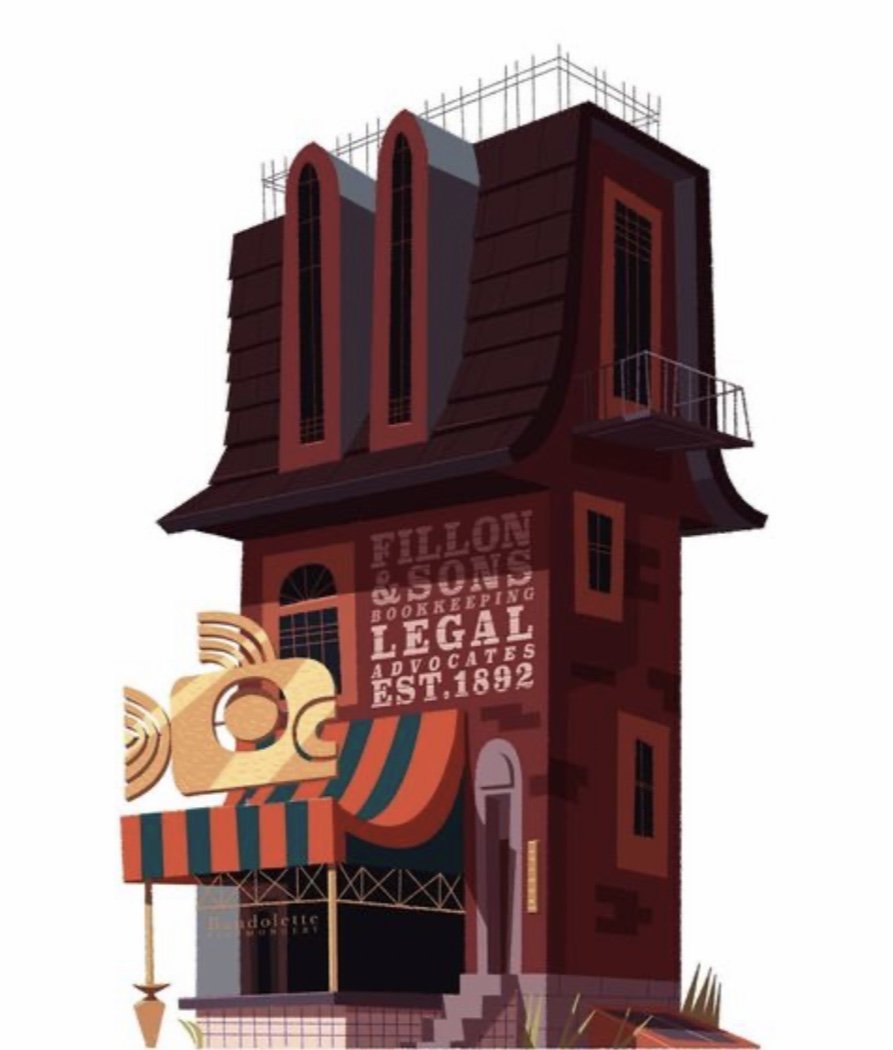
Original Concept art by Sean Mulvenna (Click on the image or here to be taken to his page)
After completing the first scene, I promptly moved on to the next. This one was really fun to texture, it was a bit of a challenge to find a font that matched the one in the concept, but I think I matched it quite well. Overall I think I replicated Sean’s design quite well, I reimagined some of the effects visible in his drawing, for instance the shimmering light reflection on the fish isn’t there due to the material, but instead a texture with that effect drawn on.
Although my model doesn’t perfectly match Sean’s design, I think its a good recreation of his style in a software where proportions and camera angels can’t be unrealistic.
Original Concept art by Sean Mulvenna (Click on the image or here to be taken to his page)
This was the last model in the set of three. Out of all three this one is my favourite. The bright colour scheme, the lighting on the side of the house, the style linework on the house, all of it was fun to try and replicate and create. Out of the three, this was the hardest to replicate, getting the camera angle right to try and match it felt near impossible, and I couldn’t get the shadows as contrasting as his concept. However, I like my render.. I like the lighting brightening it up, making the porch more colourful. I like the light bouncing off of surfaces and casting that colour onto the nearby objects. This may have been slightly harder to create than the rest, but out of all three this one I’m proudest of.
Original Concept art by Sean Mulvenna (Click on the image or here to be taken to his page)
Below you can find pre-textured renders showing the base models of all three scenes.
After being influenced by Sean, and after trying to replicate his style, I plan to to to recreate my own home’s exterior in the same style as Sean’s. Once that is completed, renders and the process will be posted below!


