Vulpine Air
Platform Mobile (IOS)
Role UX Research & Designer
Year 2024 - 2025
This speculative project is coursework that was undertaken to attain my diploma in UX Design. Over the course of half a year I researched and analysed issues users had when using competitor’s airline apps on mobiles and designed solutions as well as a functioning medium-fidelity prototype to display them. Due to the nature of the work there were constraints on time as well as an emphasised focus on the booking process of the app. Through competitive benchmarking and usability tests, pain points regarding interface, notably clutter and confusion concerning terminology and pricing, kept resurfacing. These are core areas which I diverted my focus to when working on this project, in the aim of creating a smoother user flow.
Stage 1: Research
P3: Notetaking
Research begun with competitive benchmarking in the form of viewing and analysing usability tests provided by the Design Institute. This allowed me to identify the strengths and pain-points prevalent in existing competitors apps such as AerLingus and EuroWings. My starting goal was to collate data and begin quantifying the impact of usability problems, more specifically, to find out which problems circulated between focus groups and testers, in order to best determine which issues required more attention when designing proposed solutions.
When analysing the recorded usability tests, I was able to gain insight into how users navigated and interacted with both of these airlines and where problems were starting to grow. When watching users try to book a flight, I was able to uncover that users were often frustrated and confused by the interface of both apps; terminology which was used was often misunderstood or unclear, and clutter in the UI frequently had users skip over calls to action or miss important information such as pricing or more importantly whether or not the flights were one way or return. Users did also comment on preferences of features they would have liked to see, such as a quick and easy way to convert currency to their own, a problem possibly caused by a lack of smart default. Some direct quotes from users regarding the overall experience can be seen below:
“I would like all the information about the flight to be available…”
“A small breakdown of what the differences were between various fares that you could see at a glance…would be helpful…”
“It was very, very unclear…it should have been more clear”
Upon completion of this document it seemed to me that the manner in which users had to hunt down wanted information that was not clearly shown, and the constant push of extra additions to their flight (presumably for edge case users) was interrupting the flow of the main demographic. However further research was needed to validate and lower the margin of error to confirm or deny whether the behaviours and goals of these users were an accurate representation of a larger audience...
To view the annotated notes, in full please click the button below. Alternatively two screenshots can be seen below of the documented I created.
P4: Usability Tests
After analysing the usability tests provided by the Institute, I began my own self-led research by conducting both remote and in-person usability tests on multiple volunteers. These tests focussed on other airlines, such as Ryan Air and EasyJet, to try and see if there was a pattern across competitor apps in pain-points and exploitable weaknesses. In all tests I conducted I gave the users the same tasks and conditions in order to attain viable and fair data.
By gaining my own research data I was able to triangulate and verify the information previously gained in the prior project. Users I tested echoed similar if not identical frustrations as previously seen, where they commented on struggling with a barrage of information and clutter, which was often times presented at the wrong time. This coincided with small hard to spot calls to action and hard to find product details. Cumulatively this led to users seeing too much of what they didn’t want to see and as a result missing what they wanted to find. On top of already listed concerns, users did state having trouble understanding the seat selection process due to a lack of obvious key and visuals, and one user did find it strange that the app didn’t inform them how many more steps were needed in the booking process, commenting “How much more is after this…?”. Collectively, almost all of these pain-points dragged out what should be a quick and smooth process, into a frustrating and overly complex experience for the users.
A screenshot of one of the user tests can be viewed below, however for concerns with privacy, the actual tests cannot be posted here.
Stage 2: Analysis
P5: Affinity Diagram
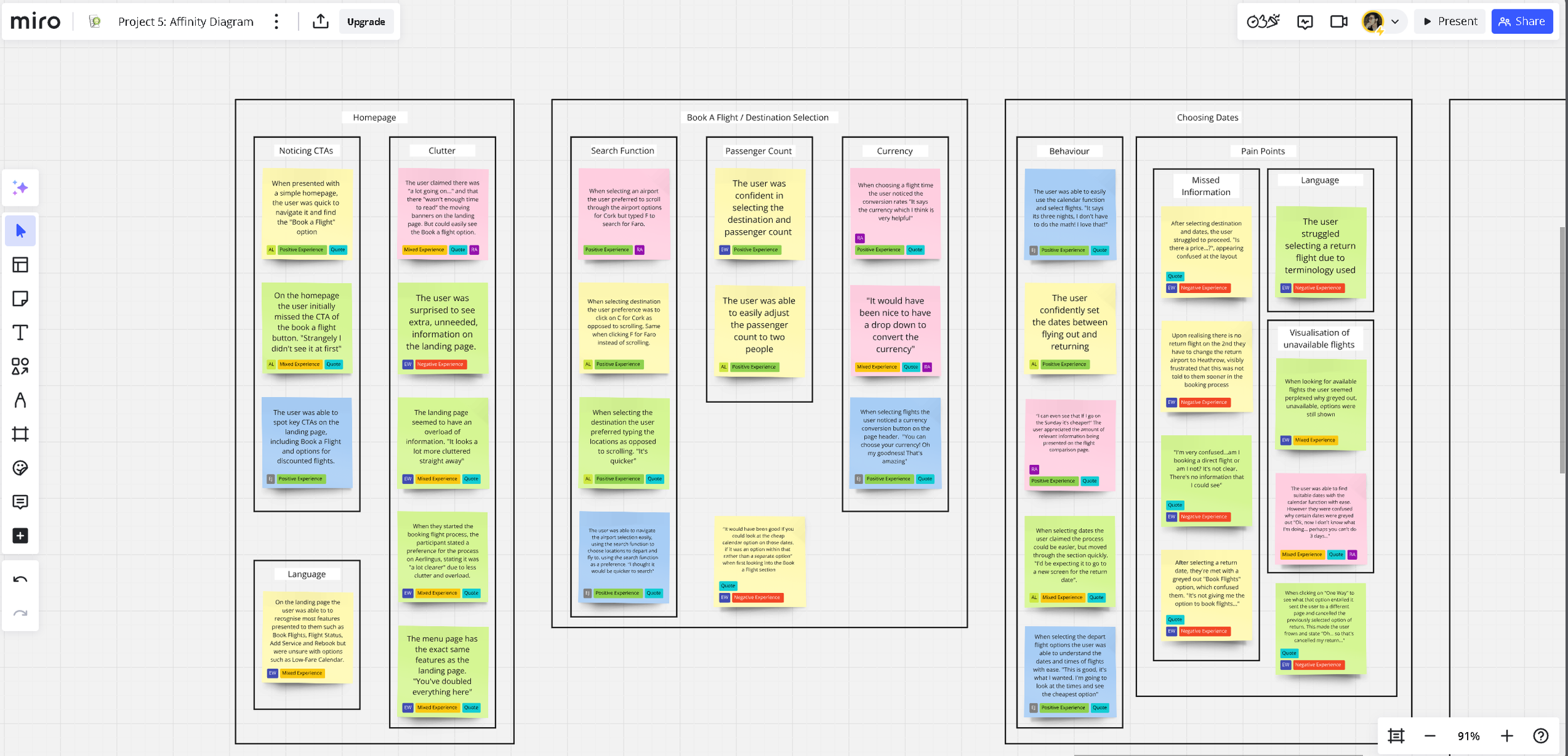
With the research stage of the project completed, I moved on to the Analysis block, beginning with the creation of an affinity diagram using both previous research inputs. This previously un-organised data could now be displayed coherently, to help identify which pain-points where more universal. The affinity diagram helped distinguish user preferences and the wants of edge-case users to the high-priority changes which needed to be made. It is worth noting that terminology and the way in which information was displayed was a frequent pit-fall of the apps tested; these two issues combined created numerous unwarranted struggles when users where trying to use the calendar function, select seats and choose between options of fares available. An overcomplicated homepage full of clutter also hindered the speed it took users to find necessary calls to action, although this was a secondary issue in comparison. Due to time constraints of the course, I knew I could only focus on the core issues experienced by users, and this affinity diagram aided in prioritising from a triage of issues users had commented on.
The button below will take you to my Miro-board which displays the final Affinity Diagram I submitted, and the pictures below show the stages of the diagrams completion through screenshots taken as I built it.
P6: Customer Journey Map
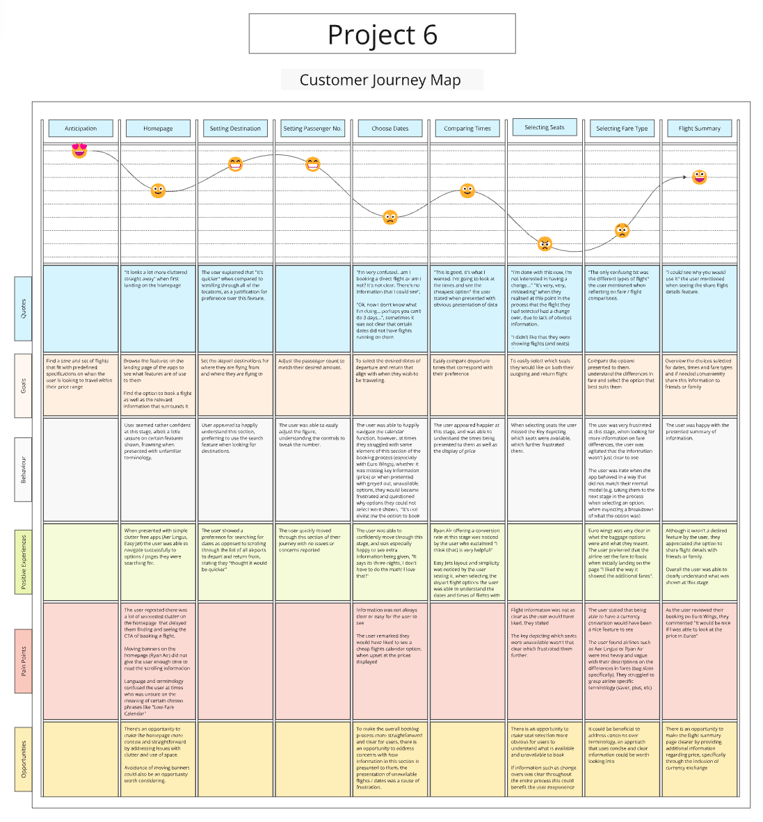
Upon completion of the affinity diagram, I began work on a customer journey map. This was built off of the affinity diagram as well as research data taken earlier on in the course. This not only affirmed the results of previous data and the overarching notion that terminology and the way the data was displayed were the biggest pain-points experienced, but it also helped visualise where in the user flow these issues were more prominent, and where competitors excelled. The customer journey map strived to paint an overall picture of the most common user experience, highlighting the problems and the positives, as well as the users behaviours, and goals. It also included the early stage suggestions for solutions to the problems users had been experiencing. This project allowed me to start considering changes which could be implemented, most promptly regarding the UI, layout and language used, which were now solidified as priority concerns for change.
The button below will take you to my Miro-board which showcases the customer journey map, and below you will find screenshots of the work in progress and final version.
Stage 3: Design
Design Opportunities
Below you will find the conclusions I had reached after the research and analysis stage. These were all opportunities that could help me design an airline app of my own which proposes a better user experience, which I kept in mind often.
Be more forthcoming
The design shouldn’t hide relevant information or CTAs on separate pages, or somewhere hard to spot amongst a clutter of information.
Match between system and real world
The app should use the same types of language and terminology that the customer use. Unexplained specialised terms should be avoided.
Shorten the flow where possible
Designing for edge-case users can hinder the average users experience. Although its important to give all the necessary options to users, allowing them to skip sections can help.
Display current progress
Although only a minor concern, a progress bar could help users understand where they are in the booking process and how much more is required of them.
P8: Flow Diagram
This whole stage aimed to solve the problems previously uncovered, and utilise the opportunities found. Creating a flow diagram was the first step. Using what I previously learnt, the pain-points of the users, the overcomplications of certain steps in the booking process, I started mapping out every interaction and screen state, and making changes to the flow when compared to that of a competitors service. From the research data I had amassed, a noteworthy flaw competitors had was that they forced every user to slowly browse through every add-on that was available right near the end of the booking process. This runs the risk of frustrating users and loosing a potential sale. By offering the option to skip the add-on sections for insurance, car rental and in-flight meals, edge-case users can still browse the options, but the main demographic can save time and proceed to the summary and payment stage. In summary, removing unnecessary steps and points of confusion held potential to provide a smoother flow for the users.
Please click the button below to view my proposed flow diagram, or, see the screenshot of it below.
P10: Interaction Design
Upon the completion of the flow diagram, I began the creation of a low-fidelity prototype of the screen states. This sketch detailed the screens and their transitions from the homepage up to and including the booking summary. It is important to re-affirm that this project focussed primarily on the booking process of the airline app, and therefore other screens were not fleshed out or shown in some circumstances. This was created using what I had previously learnt, including the key issues and their solutions mentioned from the affinity map to the flow diagram. This sketch has built upon the limitations and flaws of competitor apps, assigning more focus to CTAs and presenting information in a concise manner. Notable design proposals include:
A simplified homepages. Data showed competitor apps had too many navigational elements and clutter which slowed the users flow through the booking process; this proposed design has a simplified landing screen in which users are able to see obvious CTAs to book a flight as well as an interactive map that would show popular destination locations and low-fare flights.
A carousel for baggage selection. Many users that were tested struggled with the terminology and display used during baggage selection. This design offers a carousel, here all of the relevant information can be present and the user can swipe through the options available. Price, bag size and what is included in each option is listed with no unnecessary content burying this information.
A concise, expandable add-ons page. Building on the research and the flow I had previously created, I have suggested that having the options of Add-ons on one page that can be expanded out section by section, could allow users to quickly see a brief summary of what else is available outside of the flight details they have already selected. Those uninterested can skip straight to the summary page, saving users time and energy.
I also designed the payment page to have the option for users to view/change previously made decisions during the booking process in case they have a change of mind or made a mistake prior. Parts of this idea were later tweaked when making the prototype, but I will expand on that shortly.
The button below will take you to the Miro-board which hosts these sketches and their relevant annotations, alternatively you can also view a snippet of the sketches below.
Stage 4: Prototyping & Handover
P12: Prototype
This final stage of the course accumulated all previous stages and afforded the creation of a functional medium-fidelity prototype packaged with handover notes which would work to assist future developers in creating a final build. Using the screen sketches I had previously made, I began my own research into the UI and visuals of the app. Although this was not a requirement of the course, I believed that a polished interactive prototype with visual elements and a clean and colourful UI could help assist the user experience through more noticeable affordances and CTAs. I settled on an orange dominant colour scheme and worked on other branding elements such as a logo and title, and then started work on creating the screens and screen states of the booking process. It is worth noting I did also make changes to the design during this part of the project when creating the prototype, however this was based on frequently conducted user tests.
To the right, you will find the playable prototype.
Testing:
When creating the prototype I was able to user test it with a few friends and colleagues. Although I understand this is not ideal test subjects, due to the limitations of time on the course it was the only feedback I could quickly receive. Three rounds of testing were conducted with multiple testers before submitting the final prototype, and therefore three versions of the prototype were created. Below are the noteworthy changes between each version based on user testing feedback. Changes between Version One and Version Two are as follows:
The payment page was divided into two pages, bringing about a summary page prior to payment. This was decided due to collective concerns that the view/change options (albeit not interactive in this prototype) were too close together. They now follow standard tap target conventions of being 48px tall.
Calls to action were enlarged to further draw attention to them.
The progress bar was changed to a moving icon of a plane amidst user concerns and confusion that the original version looked interactive (like a carousel with dots affording slidable interactivity)
Changes between Version Two and Version Three:
A sign-in and register page, accessible from any screen state along the main flow, was added to demonstrate this page’s layout.
I removed options to "view/change" outbound/inbound flights on the summary page upon a realisation that offering this feature at the very end of the booking process would require alternations to almost all aspects of the booking.
For convenience I have included a button below to the Figma file, here you can see different pages which include the multiple versions I created, as well as early UI tests. Below you will also find a slide show of work in progress.
P16: Annotations
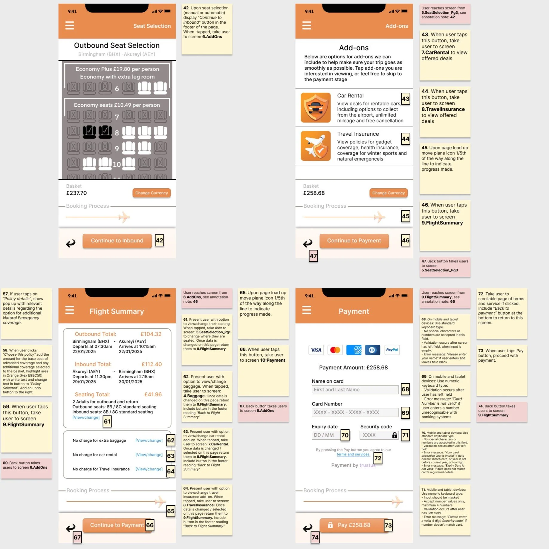
With the medium-fidelity prototype completed, the final stage of the course was to write up the design annotations. These annotations provide sufficient detail to meet the needs of developers, focussing primarily on functionality, how the system behaves and responds to actions, and communicates results. The notes also expressed which language should be used in CTAs as well as in error messages if a user makes a mistake filling in data input fields. Below you will find a button that will take you to the annotated notes in full, as well as screenshot examples of the annotated notes made.


